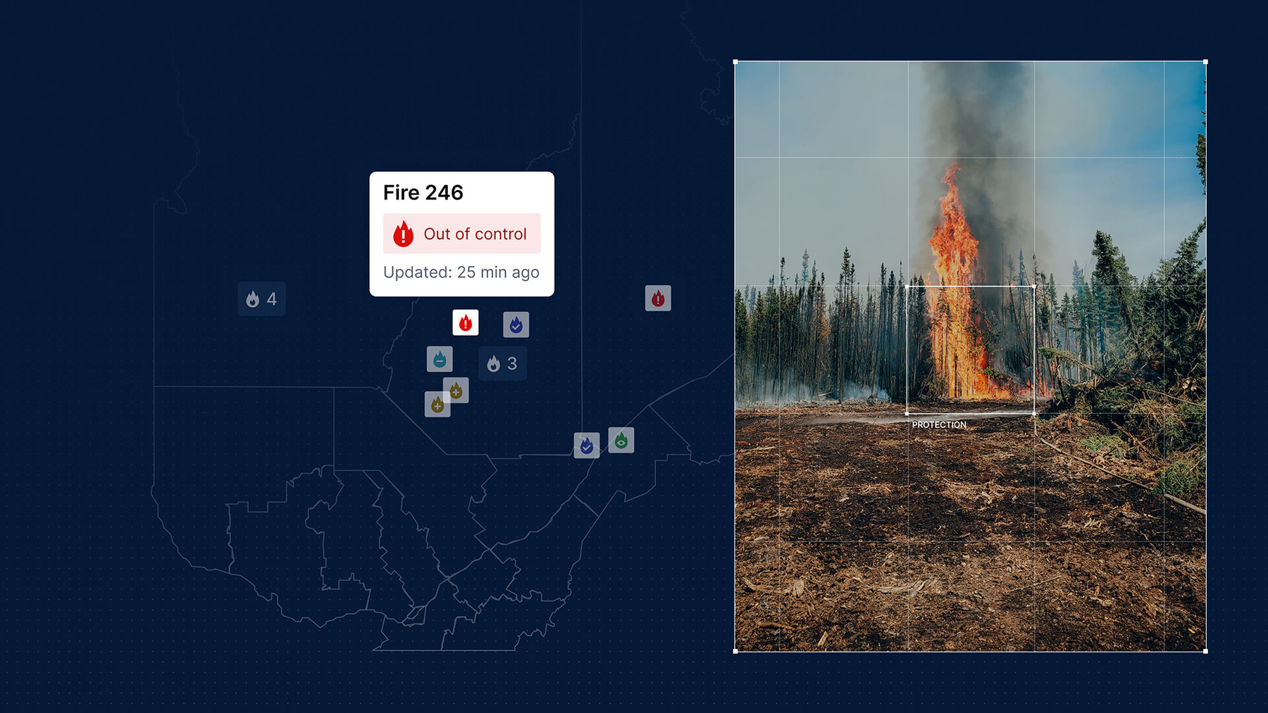

Designing for the extreme
Architecting a rapid-loading map of provincial fire activity was a significant technical feat, but visual clarity was the true challenge. We engineered a “worst-case scenario” UX to maintain legibility when multiple data layers (smoke, lightning, fire perimeters) overlap. Stress-testing these extremes led to a visual language of distinct patterns and icons that instantly communicate urgency on any screen size.
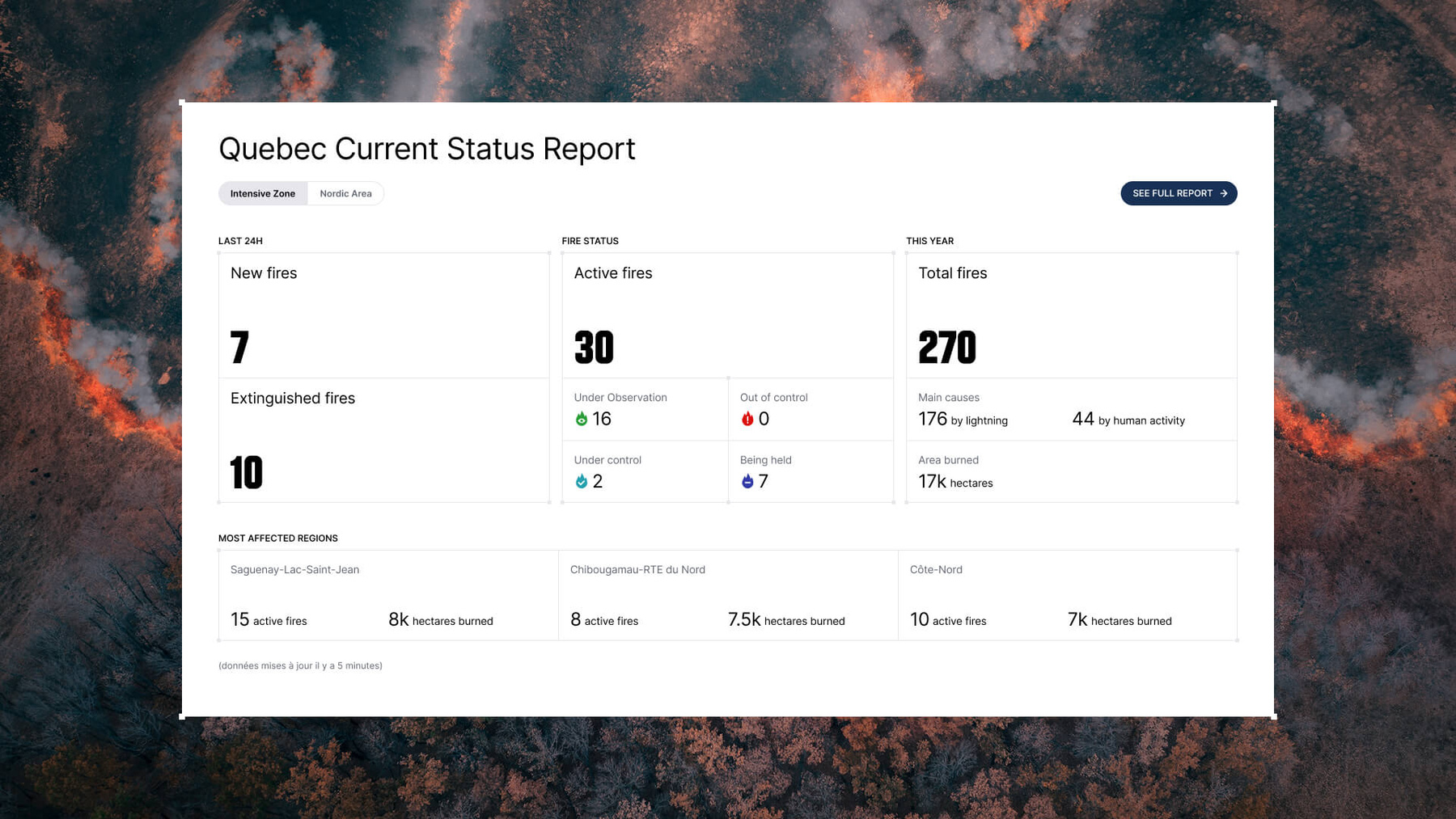
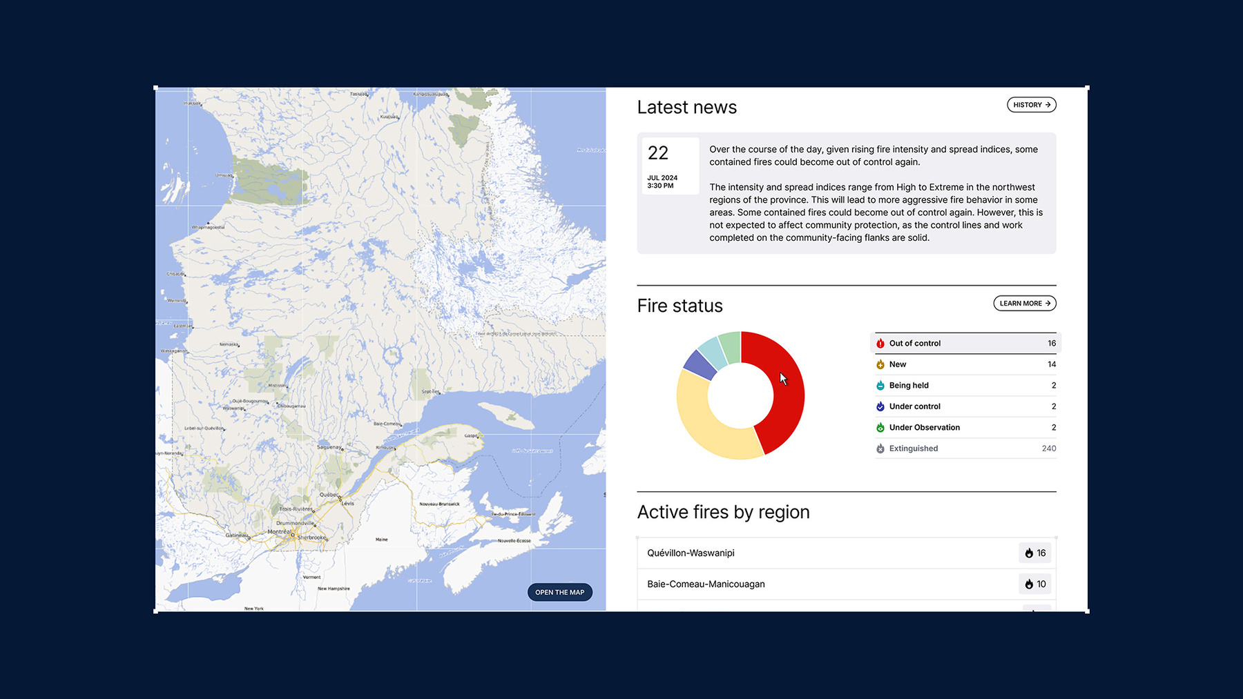
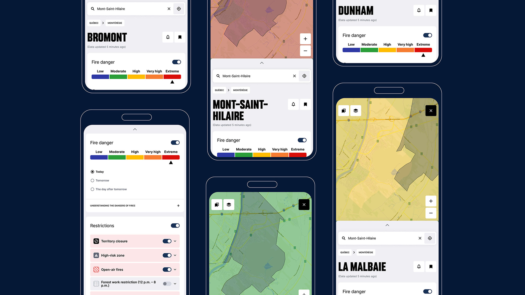
UX duality: from power user to citizen
The map balances two worlds: deep data layers for power users and instant clarity for the public. By allowing precise filtering by region or fire, the interface streamlines navigation while subtly educating the user. Every interaction does more than filter data, it builds awareness, turning technical telemetry into a tool for community prevention.