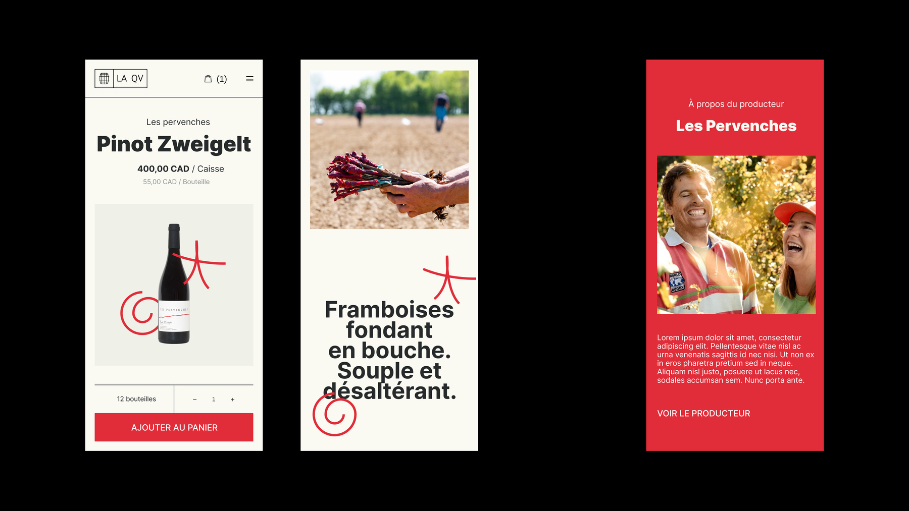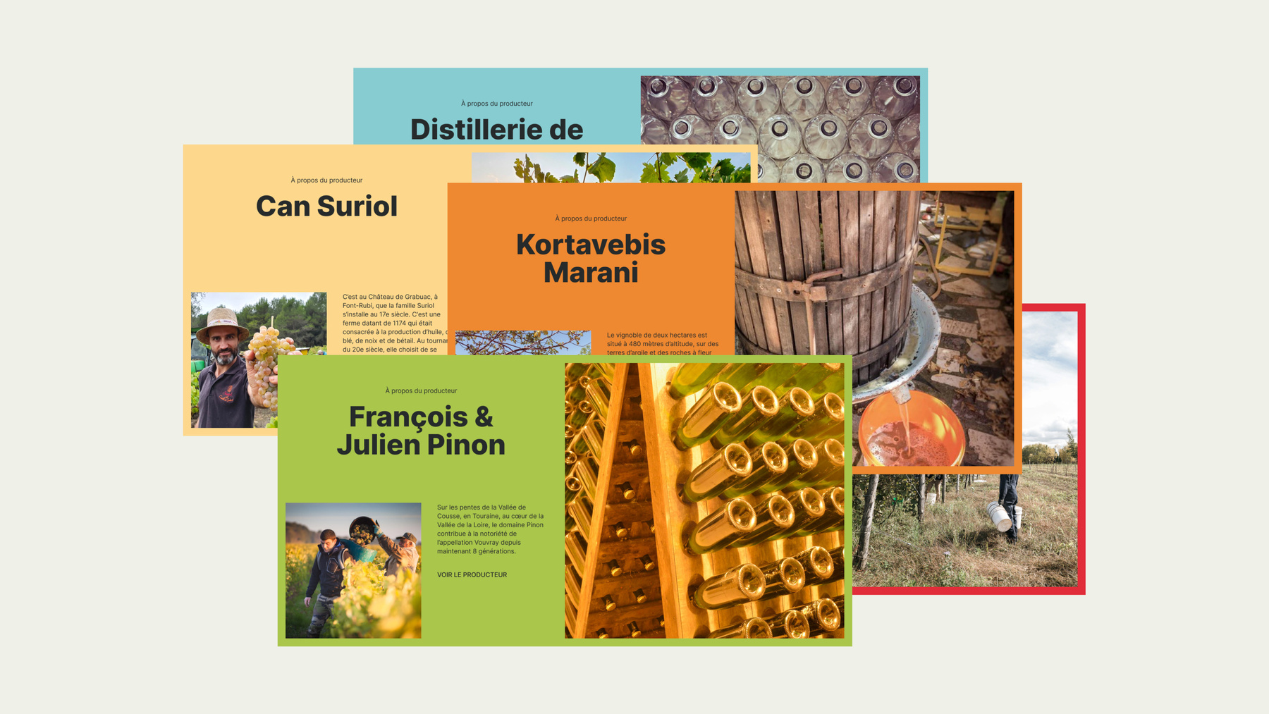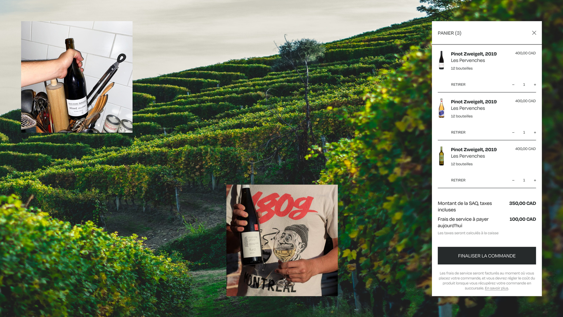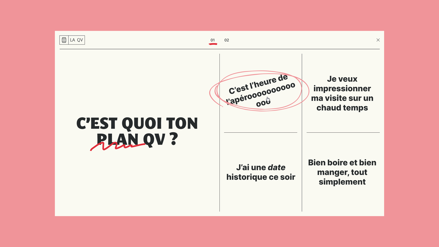


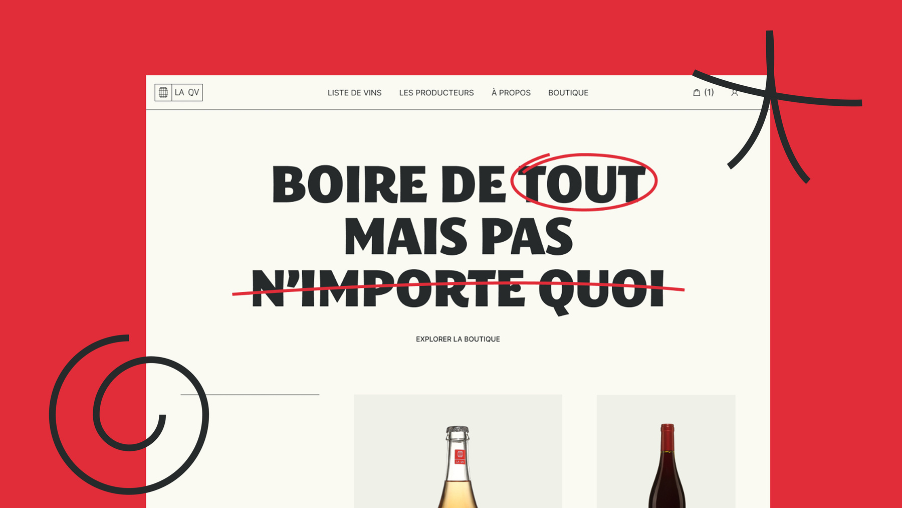
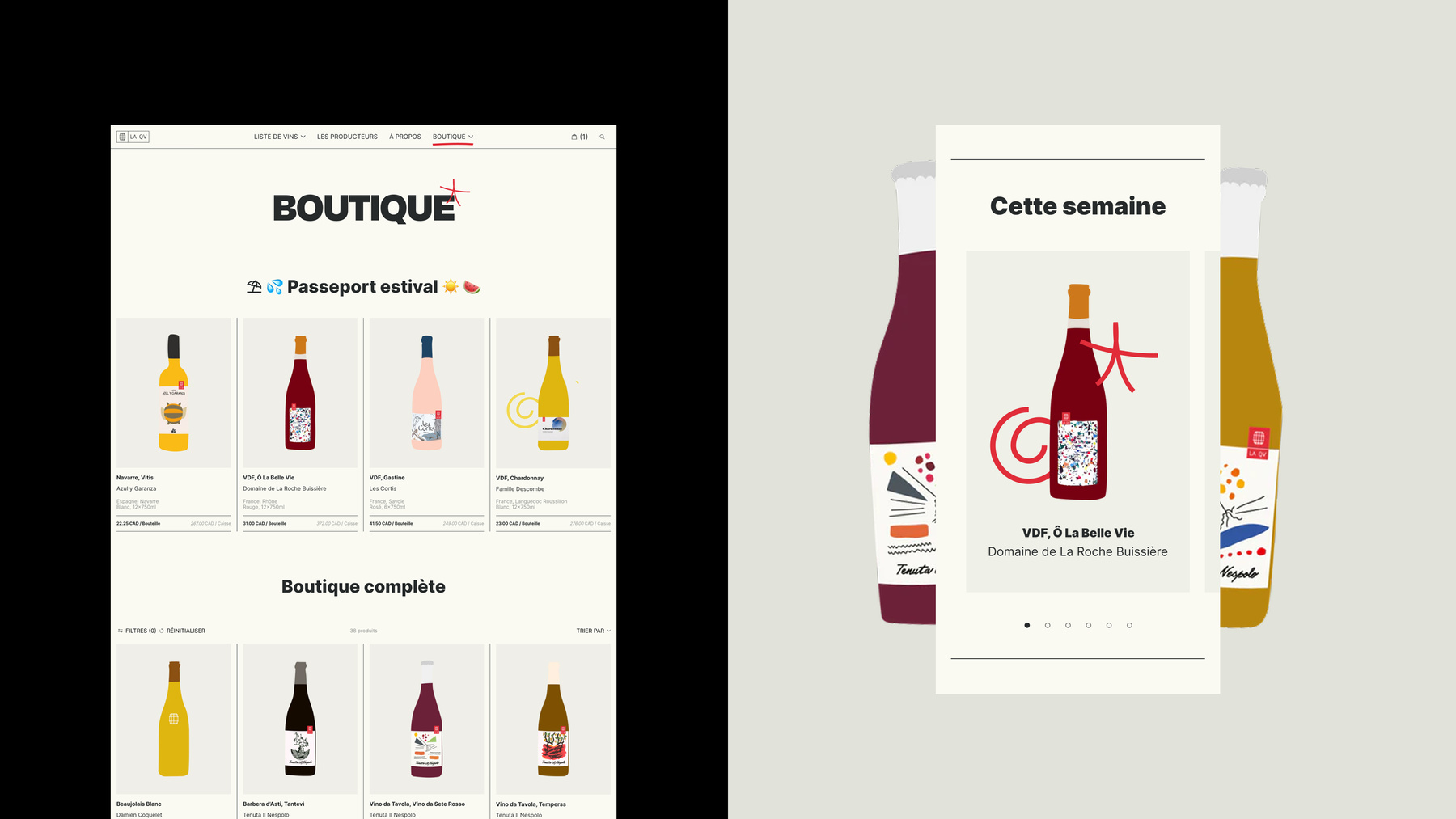
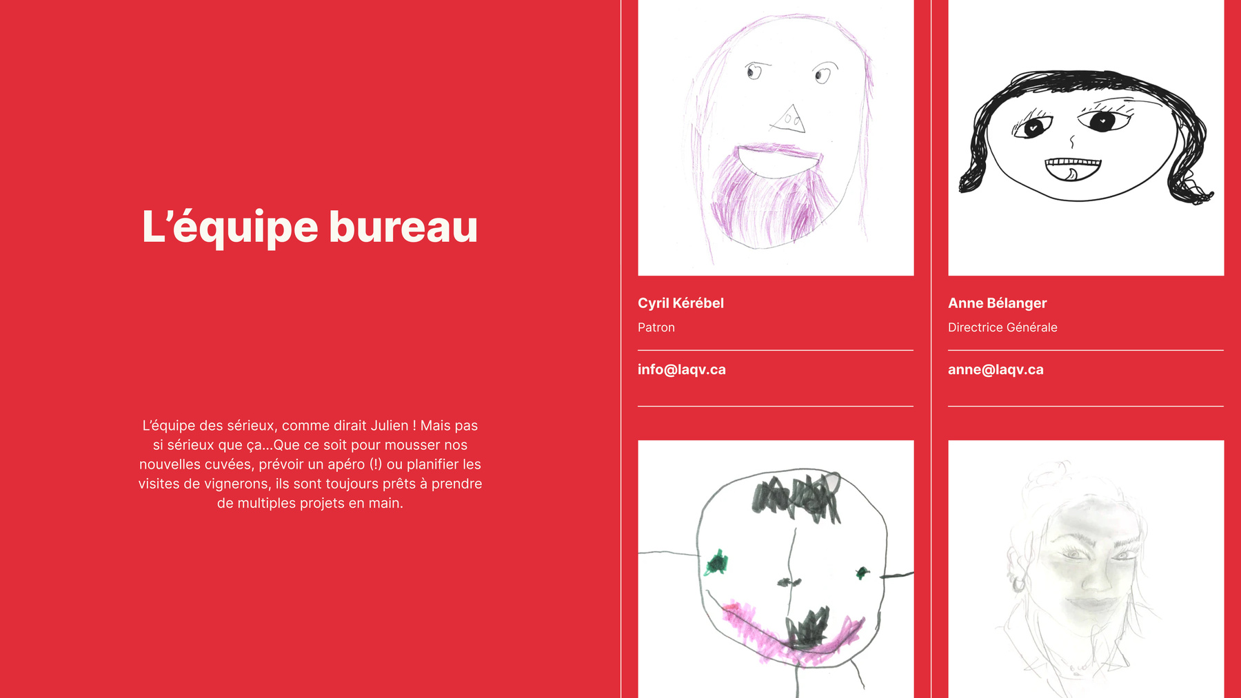
La QV’s reimagined platform brings the brand’s unconventional, playful energy to every corner of the user journey, making the sometimes complex wine world feel welcoming and easy to explore. The eccentric identity is anchored by vibrant visuals, hand-drawn team portraits, visual cues and a zany tonality.
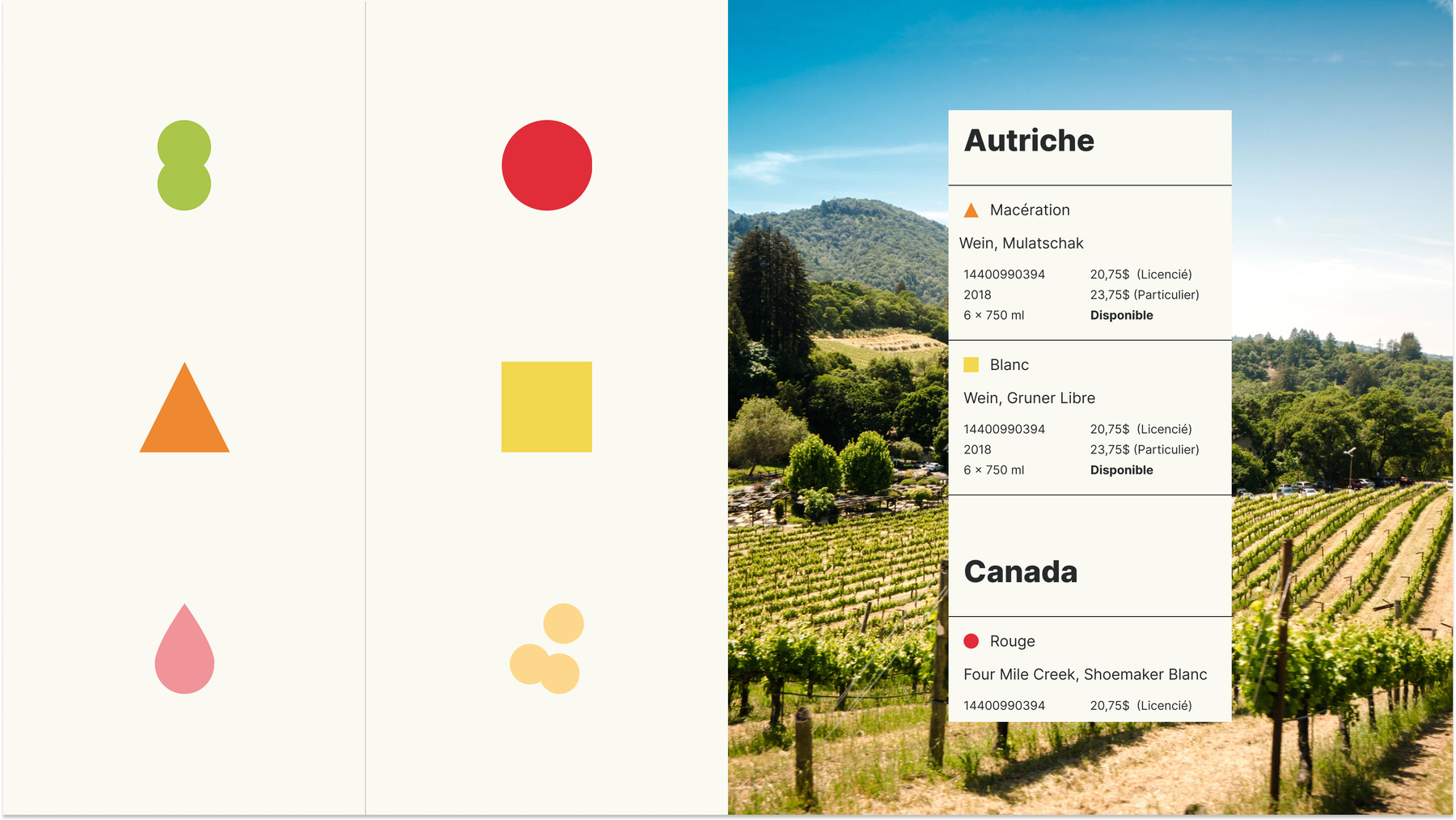
Using colour and iconography to foster accessibility
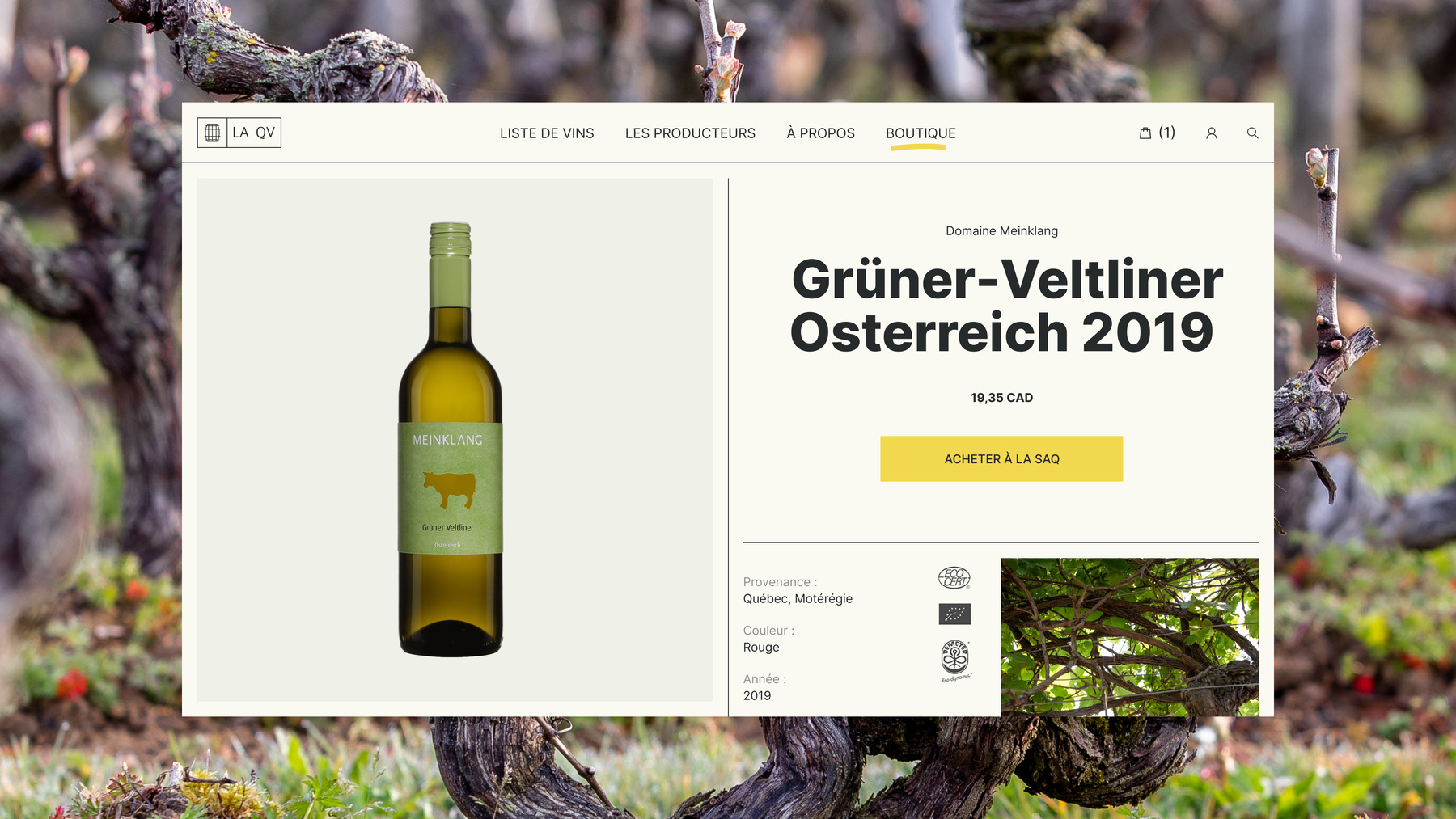
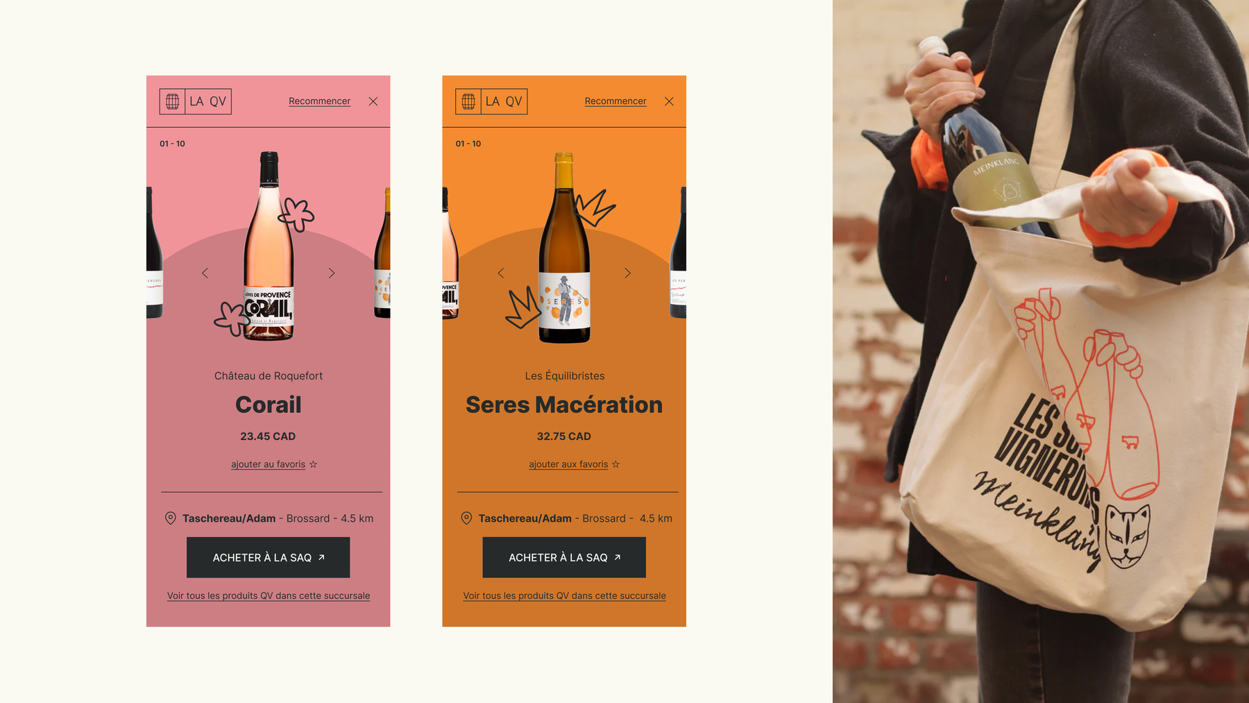
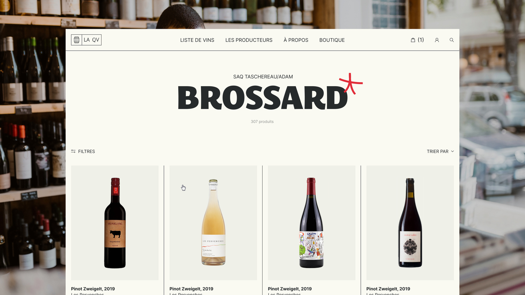
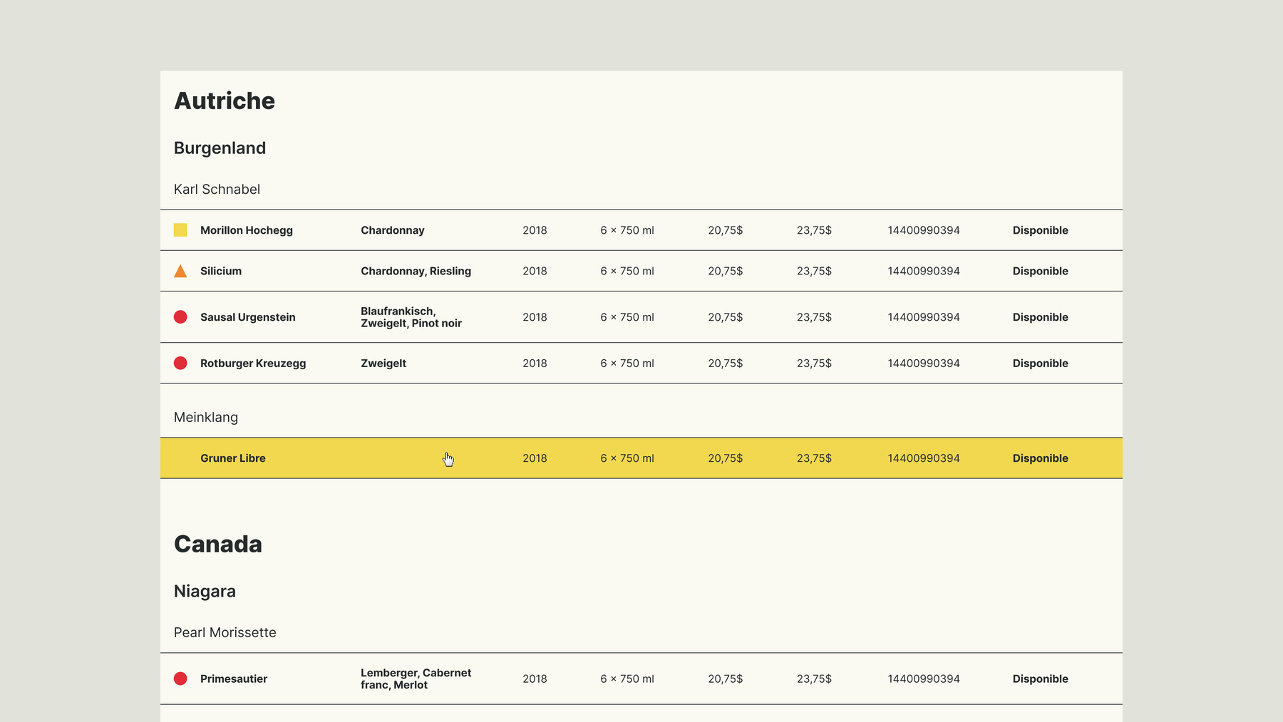
Wine is in a rarefied world with codes and intimidating terminology that describe the products and their characteristics. To make it more accessible and empower newcomers, we used a mix of colours and iconography to differentiate varietals and key characteristics throughout the site.
We also created simple product pages with just enough information to appeal to connoisseurs while not overwhelming less knowledgeable consumers with hard to grasp content.